
Role: Product Designer | In-House
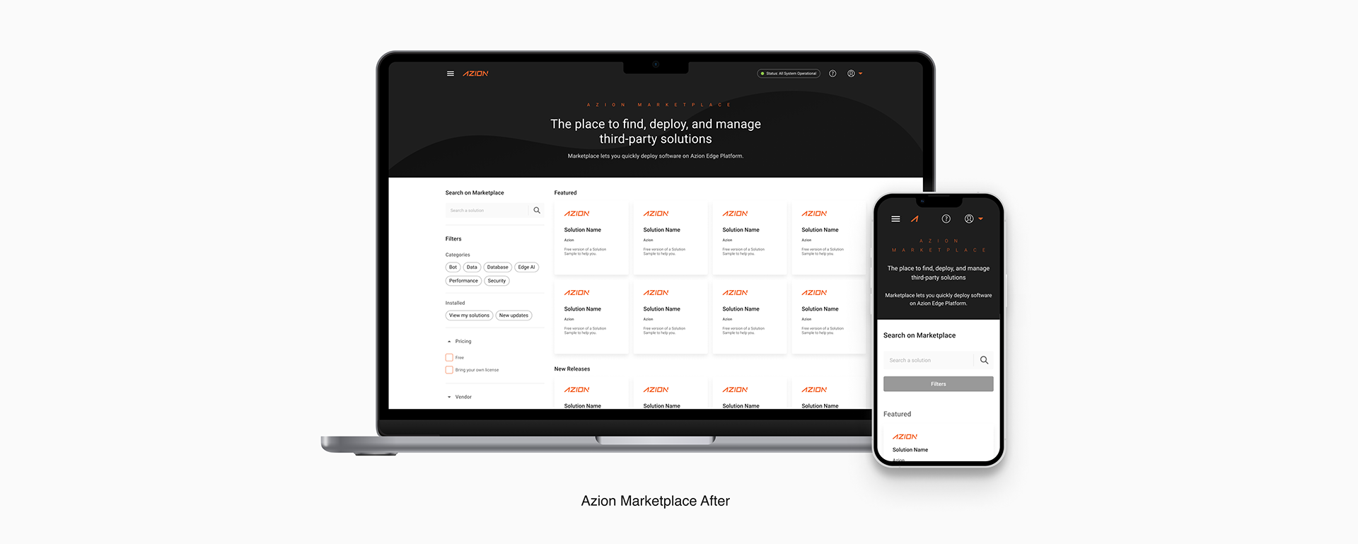
While users of the Azion Marketplace sought tailored solutions for their edge computing needs, our goal as a team was to provide a more flexible and intuitive discovery experience. The redesigned search and category filtering system empowers users with greater control, enabling them to efficiently identify the most suitable solutions for their specific application requirements.
The Process:
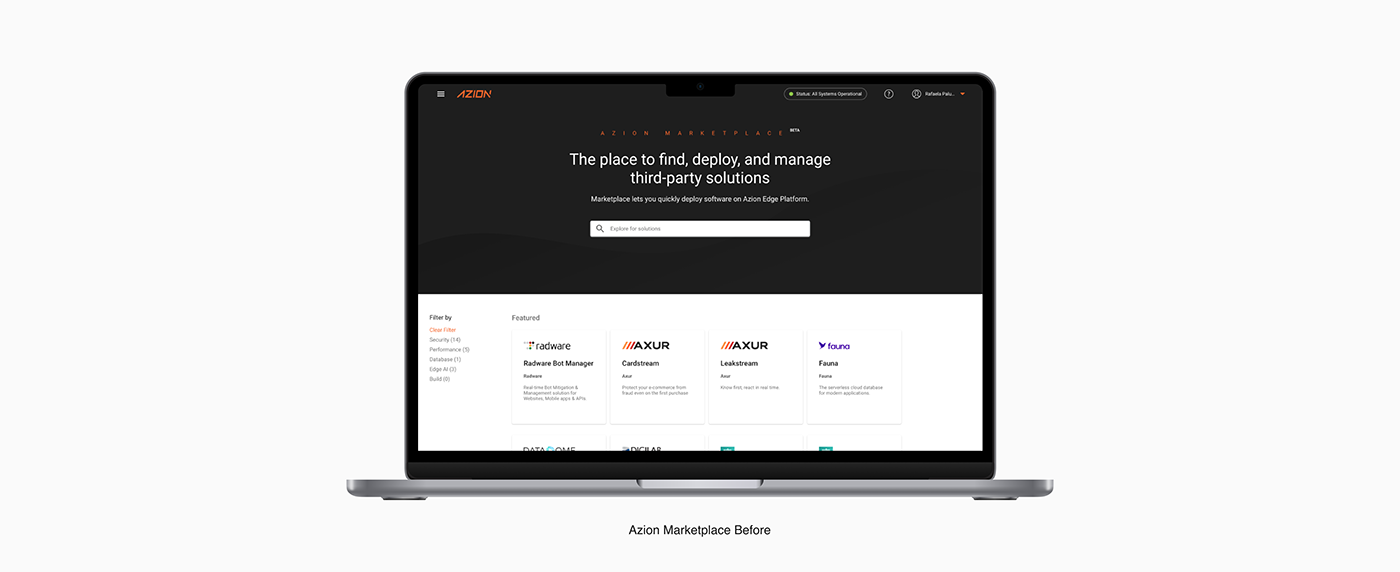
A heuristic evaluation was conducted on the on the marketplace to assess the overall usability of the platform. The analysis revealed key usability issues that were negatively impacting the efficiency of the user experience, particularly in navigation, content discoverability, and interface consistency. These findings highlighted the need for improvements to ensure a more intuitive and seamless experience for users when interacting with the platform.
A heuristic evaluation was conducted on the on the marketplace to assess the overall usability of the platform. The analysis revealed key usability issues that were negatively impacting the efficiency of the user experience, particularly in navigation, content discoverability, and interface consistency. These findings highlighted the need for improvements to ensure a more intuitive and seamless experience for users when interacting with the platform.
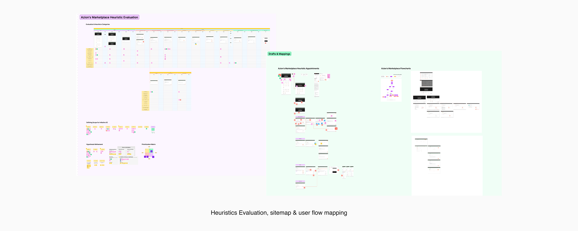
Heuristic Evaluation Findings:
• Lack of system status visibility: Users weren’t given clear feedback on system processes or completed actions.
• Poor error prevention and recovery: The interface lacked guidance to prevent errors and offered unclear error messages.
• Unclear navigation structure: Users struggled to understand where they were and how to navigate through the platform.
• Inconsistent terminology or labels: Varying or unclear labels led to confusion about actions and content.
• Weak visual hierarchy: Key content and actions weren’t visually prioritized, making it hard to scan and engage.
• Inaccessibility issues: Visual and interactive elements didn’t fully support accessibility, particularly on smaller screens.
The Marketplace website was facing several usability and experience issues, but it was essential to address one problem at a time. After presenting the findings from the heuristic evaluation to stakeholders and developers, we applied a Prioritization Matrix to clearly identify which improvements could be made within the available budget. As a result, we focused on redesigning the search and filtering experience.
In addition, I mapped the current site structure and user flow to gain a comprehensive understanding of the system and its information architecture, ensuring a more strategic and informed design process moving forward.
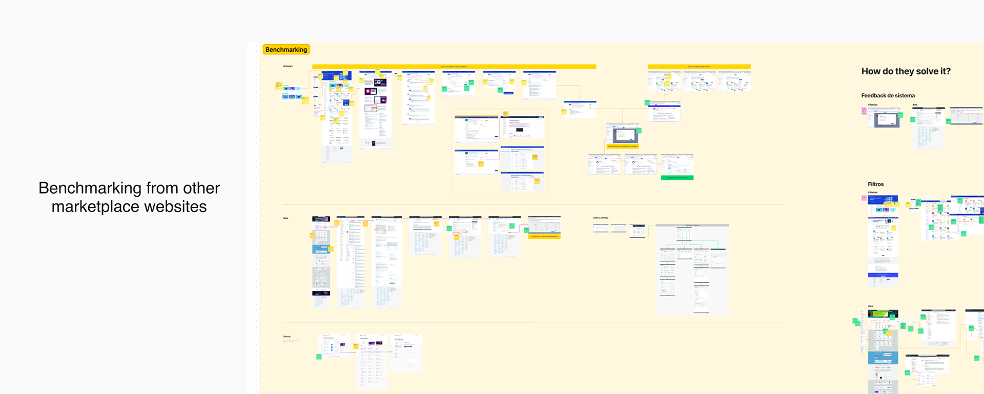
I also conducted a competitive benchmarking analysis of other marketplaces in the industry to understand how similar platforms addressed search and filtering challenges. This helped identify best practices, common UI patterns, and opportunities for differentiation in our own solution.
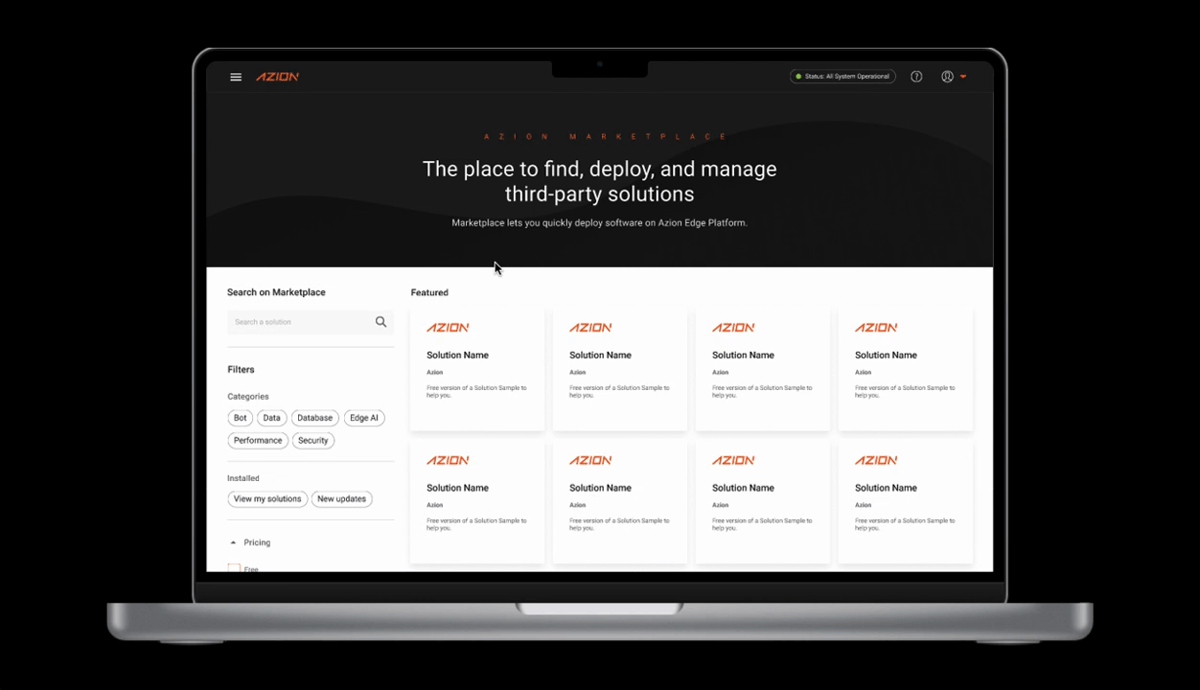
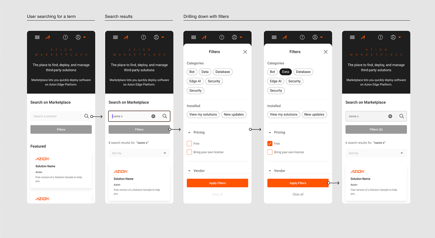
The New Experience:
The new search and filtering system now works seamlessly to help users refine their interests quickly and efficiently. A well-designed set of filters not only streamlines the discovery process but also significantly enhances the overall user experience. By allowing users to easily narrow down their needs and navigate the platform with greater autonomy, the number of support requests related to finding specific solutions on the Marketplace is expected to decrease.
The new search and filtering system now works seamlessly to help users refine their interests quickly and efficiently. A well-designed set of filters not only streamlines the discovery process but also significantly enhances the overall user experience. By allowing users to easily narrow down their needs and navigate the platform with greater autonomy, the number of support requests related to finding specific solutions on the Marketplace is expected to decrease.
Heuristic-Based Improvements Implemented:
• Organized and easy-to-navigate interface, enhancing clarity and system usability.
• Filter categories tailored to the business segment, increasing relevance and supporting recognition over recall.
• Intuitive and visually distinct search and filter elements, helping users understand how the system works and set clear expectations for outcomes.
• Real-time, dynamic feedback showing the number of results as users begin typing or applying filters, improving system status visibility.
• New interface enables simultaneous filtering and sorting, offering users greater efficiency and control.
• Effortless removal of selected filters and search terms, reducing user friction and supporting error recovery.
Responsiveness:
Lack of responsiveness was a major issue in the previous version of the website. As we redesigned the entire search and filtering experience, it became essential to consider the mobile experience as well. By analyzing user behavior through Hotjar, I observed a growing number of users accessing the marketplace from mobile devices — and struggling with navigation due to the lack of responsiveness. These insights were key in communicating to the product manager and development team the importance of prioritizing a responsive version of the website.
Lack of responsiveness was a major issue in the previous version of the website. As we redesigned the entire search and filtering experience, it became essential to consider the mobile experience as well. By analyzing user behavior through Hotjar, I observed a growing number of users accessing the marketplace from mobile devices — and struggling with navigation due to the lack of responsiveness. These insights were key in communicating to the product manager and development team the importance of prioritizing a responsive version of the website.
Thank's for watching!